About the project
A profile catalog for an 18+ escort services website. A visitor chooses a city, browses profiles by category, filters them by parameters and contacts the chosen person via messenger. We designed the website and went through two visual concepts — a dark one and a light one.
The challenge
Sites in this niche usually look the same: an overloaded photo grid, tiny text, intrusive banners. We had to create a catalog that feels like a premium service yet is as convenient as a regular marketplace: quick category selection, detailed filters, a clear card with prices and direct contact without extra steps.
First concept: dark
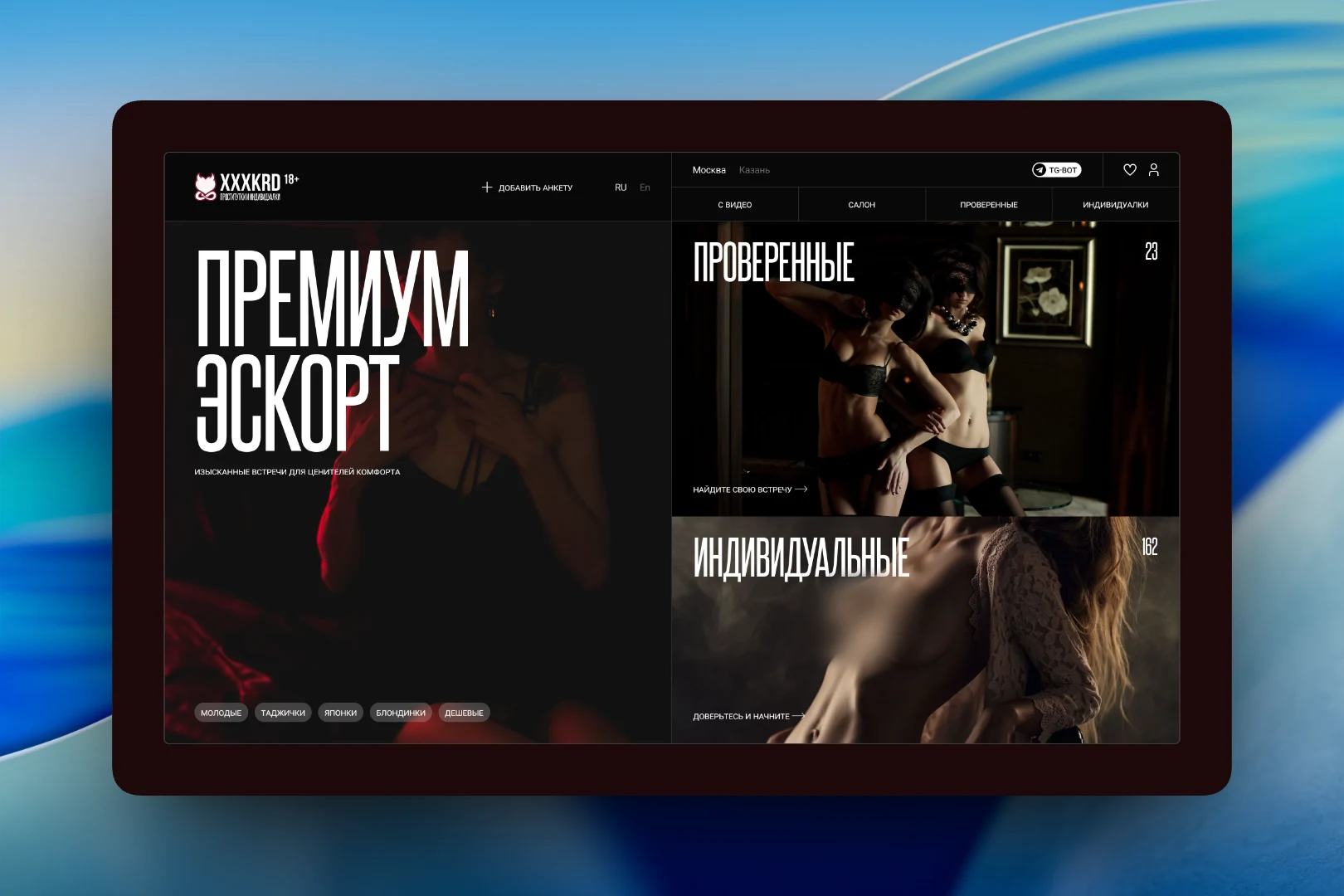
In the first version we bet on a strict, almost magazine-like presentation. The screen is split in half: on the left, a large headline in a narrow tall typeface and a subheading; on the right, two large entry blocks to the "Verified" and "Independent" sections with a profile counter in the corner. The header holds the city switcher, RU and En languages, a link to the Telegram bot, favorites, profile and an "Add profile" button. Below the headline are quick tags for popular queries, and a horizontal menu leads to the "With video", "Salon", "Verified" and "Independent" sections.
Second concept: light
The second version is light, in a pink palette, with a wide grotesque typeface and soft rounded elements. Navigation is laid out as a row of section buttons: "New", "Verified", "Independent", "With video", "Salon". Next to them are favorites with a counter, profile, contact and "Add profile".
The main difference is that search is built around filters. Right on the first screen, over the photo, you pick the metro station and district, and on the right is a parameter panel: age, weight, height and other ranges on sliders, a "from–to" price with a switch between one and two hours, and filtering by appearance. The user narrows the results right away without going to a separate search page.
Profile cards
A card in the catalog answers all the main questions without opening the profile page. At the top is a photo gallery with indicator dots and badges for video and verification. Below are the name and age, Telegram and WhatsApp buttons, the main parameters as tags, the district and nearest metro stations. At the bottom are three prices: per hour, for two hours and per night. The phone number is hidden behind a "Show" button.
Below the grid is pagination showing the current page, and the footer has quick contact buttons: Telegram, WhatsApp and a callback request. A large wordmark on a gradient finishes the page.
Login and sign-up
Authorization opens in a pop-up over the blurred catalog, so the user doesn't lose the page they were on. Login and sign-up are two tabs of a single switch; the form consists of email or username and password, with a "Forgot password" link next to it.
The result
We prepared two catalog concepts with different characters — a dark, strict one and a light one focused on filters. Both keep the shared solutions: profiles divided into clear sections, detailed filtering by parameters, a card with prices and district, and one-click contact via messenger.