About the project
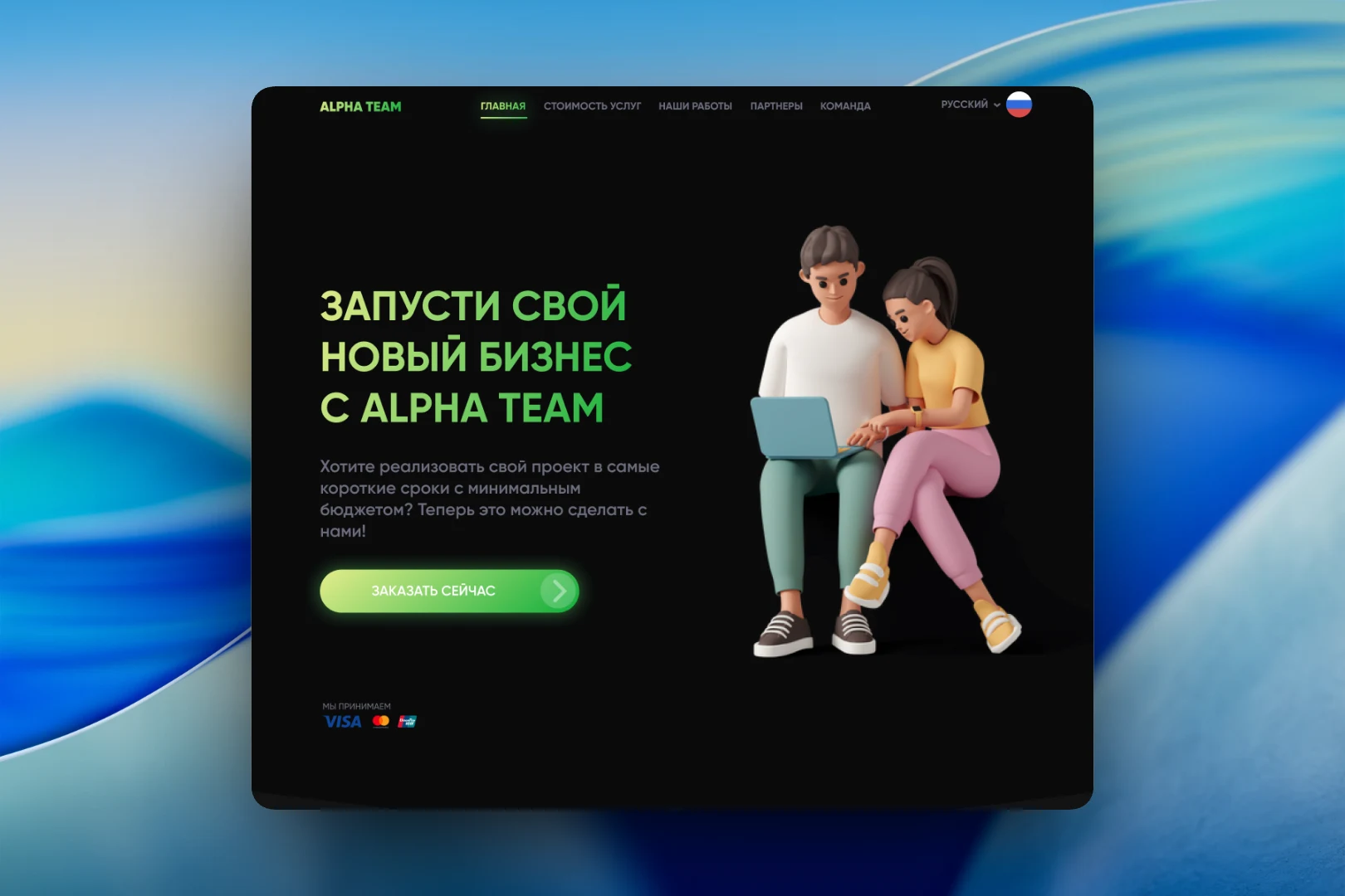
This is one of the earliest versions of the studio's own website — back when it was still spelled Alpha Team. A dark background, a lime-green gradient in headings and buttons, and 3D characters instead of stock photos. The site was conceived as a simple showcase for those who want to launch their first digital product and aren't yet ready for a big budget.
The challenge
We needed to build a site that explains in a couple of screens who we are, how much it costs to get started and how to get in touch. The audience was small companies and early-stage entrepreneurs, so the tone had to be friendly and the path to a request short. We also wanted to move away from the typical "corporate" look of agency websites of that time.
First screen and navigation
The home page opens with a direct offer: "Launch your new business with Alpha Team", followed by a short promise to deliver the project quickly and on a minimal budget, and an "Order now" button. At the bottom of the screen are the logos of the payment systems the studio accepts. On the right, a pair of 3D characters sit at a laptop — a device that runs through the entire site and sets its tone.
The header is the same on every page: "Home", "Pricing", "Our work", "Partners", "Team" and a language switcher with a flag. The active section is highlighted with a green line.
Plans instead of a price list
We built the "Pricing" page around three clear packages: "Small start" from 2,000 RUB, "Medium start" from 10,000 RUB and "Big start" from 20,000 RUB. The scale of each package is conveyed not only by its price but also by an illustration — from a single character to a whole team. Each card lists what the package includes and has its own "Order" button. In the mockup, the lists are still filled with placeholders.
News and portfolio
For news, we made a two-column grid of large cards: a preview on the left, and on the right a headline, a short teaser, the publication date and a round green arrow leading to the article. These cards were also shown on the home page so the site looked alive and regularly updated.
The "Our work" section is a dense three-column grid of identical tiles. Recent projects are marked with a red "New" label so visitors can immediately see what the studio worked on last. In the mockup, the tiles are still empty — they were meant to be filled with case covers.
Request form
The site ends with a form that has a minimal set of fields: how to address you, company name, task description and budget. The "Send" button repeats the style of the main call to action. The footer contains repeated navigation across sections and links to social networks.
Result
This site became the starting point for the studio's visual language: a dark theme, a bright accent color and characters instead of dry illustrations. The structure turned out short — offer, plans, work, request — and let visitors understand within a few minutes where to start and leave a request right away. Later versions of the Alfateam website grew out of this foundation.