About the project
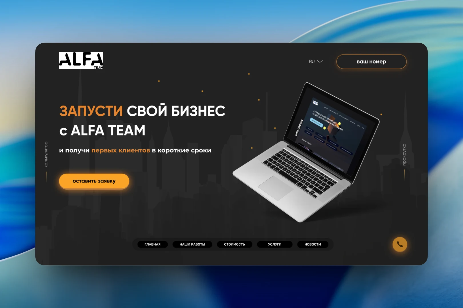
This is one of the early versions of Alfateam's own website. A dark background, the silhouette of a city at night and orange-yellow accents — the site was conceived as the studio's sales page: explain what we do, show our work and get the visitor to submit a request as quickly as possible.
The challenge
A development studio's website is read by people who most often don't yet know exactly what they need or how much it costs. So it was important for us to answer the key questions before they were asked: what the studio can do, how the work is organized, what the project will cost — and to leave a clear next step in every block.
First screen and navigation
The first screen is built around a single call to action: “Launch your business with ALFA TEAM and get your first clients fast” and a “submit a request” button. Next to it is a laptop showing an example of our work. The header has a language switcher and a “your number” button for a callback, and a round call button is pinned to the bottom right corner.
The main navigation sits not in the header but in a floating panel at the bottom of the screen: “Home”, “Our work”, “Pricing”, “Services”, “News”. Along the edges of the screen are vertical labels “calculator” and “scroll” that hint where to go next.
Pricing and comparison
We chose not to hide the question of price. Right after the first screen comes the block “Answer a couple of questions and find out the approximate cost of your project” with a “take the survey” button — a short quiz instead of a long form. Next is the “Why choose us?” table, where across four points (“Timeline”, “Cost”, “Scalability”, “Support”) the typical problems of “another agency” are compared with the ALFA TEAM approach: a turnkey website from 10 days, a fixed price, easy addition of new sections and support after the project is handed over.
Work and process
In the “Our work” section, projects are shown as large cards with website previews and a vertical label for the discipline — “WEB DESIGN”. These are corporate websites, landing pages and promo pages on a variety of topics.
The “Work stages” block breaks the collaboration down into eight steps arranged around a smartphone with a sample interface: from discussing goals and signing the contract, through prepayment and prototype approval, to staged payments, task completion, acceptance with revisions and the final payment. This layout shows the client in advance when and for what they pay.
Services
Each service got its own screen: a preview of the work on a device, a description and a starting price. In the mockup, for example, “Website promotion” starts from 1,000 rubles and “Mobile app development” from 30,000 rubles. On the right is a 01–05 numbering that lets users switch between services within the block.
The result
This version of the website became an exercise in sales structure for us: every block addresses a specific client doubt — timeline, price, process, experience — and ends with an action. Visitors can estimate the cost through the quiz, see the stages and payment schedule, and browse our work and starting service prices without leaving a single page.