About the project
This is one of the design options for Alfateam's own website — a concept in a dark palette with orange accents. In this version, we approached the site not as a one-page business card but as the studio's corporate portal with several sections: business areas, products, projects, media, careers and separate pages about the company.
Challenge
A studio website has to speak to several audiences at once: clients looking for a contractor, companies that need specialists for their teams, job candidates and partners from the professional community. We needed to come up with a structure that gives each of these audiences its own section, and a visual language that unites them into one recognizable website.
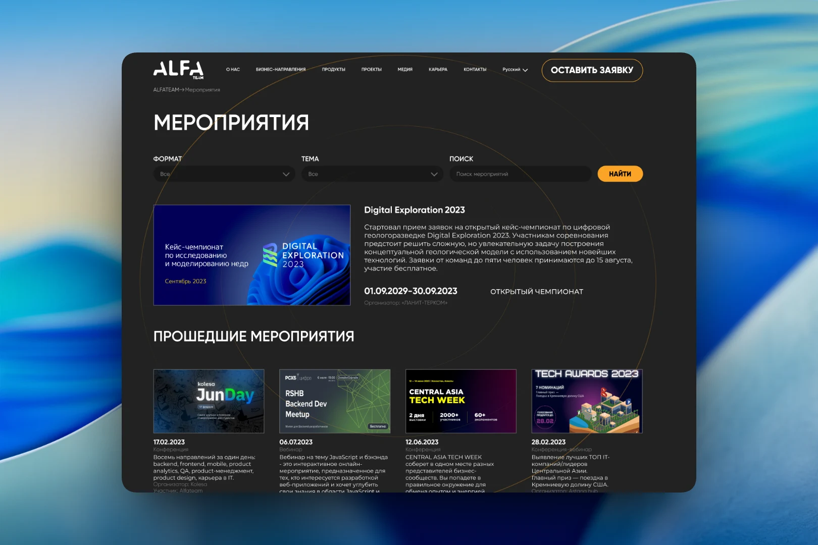
The style is built on a dark background, large all-caps headings and thin orange circles that run through the entire page. The header is the same on every screen: logo, seven menu items, a language switcher and an orange-outlined “Submit a request” button. Below the header are breadcrumbs, so users always know where they are in the multi-level structure.
Events
The events section presents the studio as a member of the IT community. At the top are filters by format and topic and a search bar. The upcoming event is highlighted in a large block with a cover image, description, dates, format and organizer. Below is a grid of past events: each card shows the date, type (conference, webinar), a short description and a line with the organizer and Alfateam's involvement.
Compliance
For corporate clients, we added a “Compliance at Alfateam” page to the “About us” section. It is a text page about the company's business principles, with a grid of documents below the text: orders, the compliance policy and its English version. Each document has a preview and file size, so it can be downloaded without going to a separate page.
Outstaffing
The “Outstaffing” page targets companies that need developers, designers, analysts and QA engineers for their teams. We designed it as a transparent price list: for each technology — Node.js, React, Vue, iOS, Android and others — there is a table with specialist levels (Middle, Senior, Architect) and hourly and monthly rates. The columns are split by engagement length, and long-term projects show the discount right away. The mockup uses placeholders instead of numbers — the page was designed to be filled in later.
Testimonials
The testimonials section is a horizontal carousel with arrows and a “View all” link. Each card contains an avatar, the author's name underlined in orange, the text and a space for an image. The cards are large and dark, matching the style of the rest of the site.
Result
This concept gave us a way to break the studio's activities down into separate, clear sections: events, corporate documents, outstaffing terms and testimonials. Even where the content is still filled with placeholders, the page structure already answers the questions of a specific audience. A shared header, breadcrumbs and a recurring graphic motif tie all the sections together into a single website.