About the project
AltaiTour is a mobile app concept for travelers planning a trip to the Altai Mountains. In the app, users can pick a tour, compare offers by price and reviews, book a trip and follow news from tourist camps. We designed the app's structure and first screens — the mockups still have a “LOGO” placeholder instead of the brand mark.
The challenge
When choosing a tour, people compare several things at once: where they will go, for how many days, how much it costs and what other travelers say. If this information is scattered across different pages, the choice drags on. We needed to gather everything that affects the decision in the tour card while leaving room for “live” content — news from holiday camps that helps people get a feel for the place before the trip.
Tour catalog
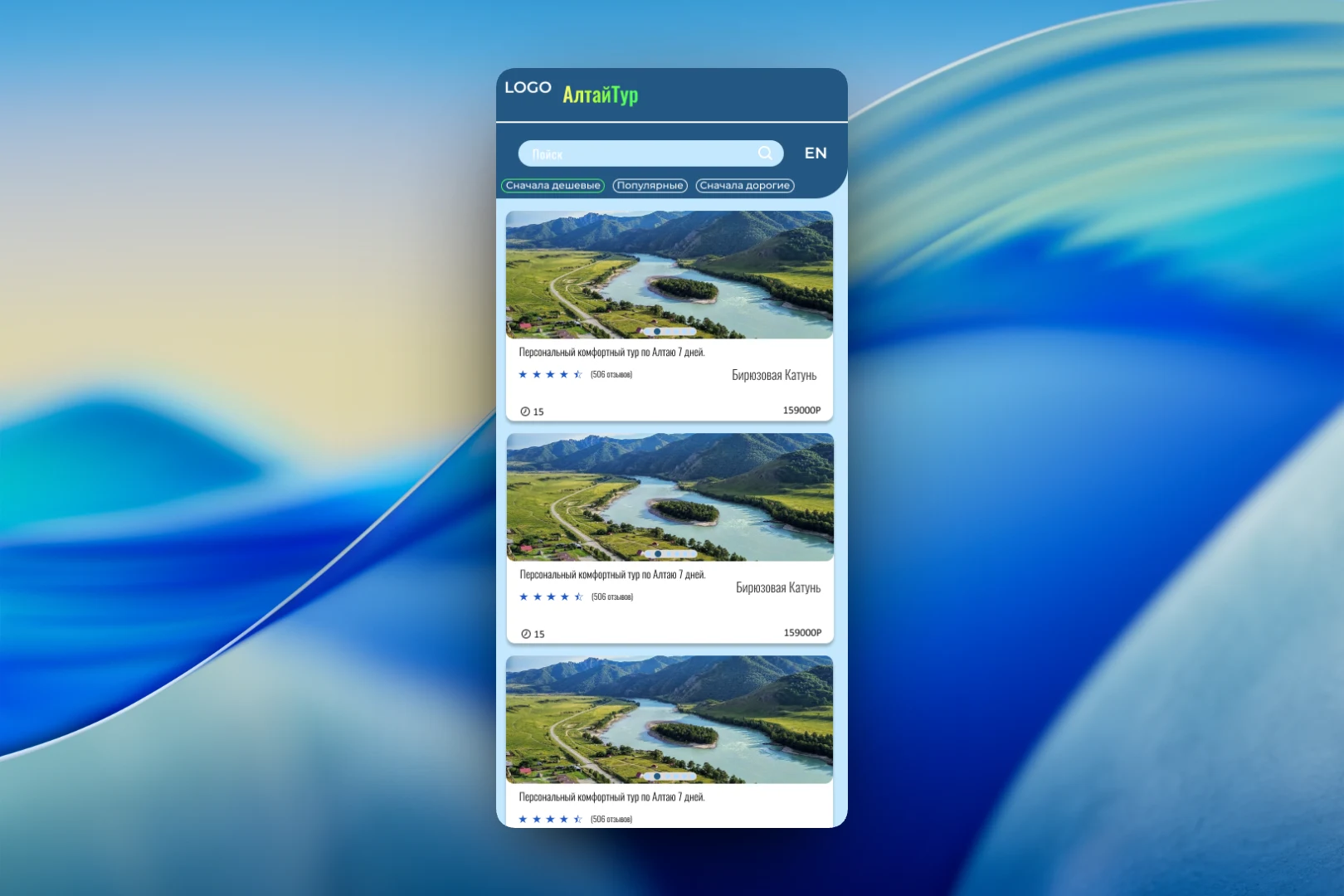
The main screen is the list of tours. At the top are search and an EN language switcher: the app is also intended for international guests. Below the search are three quick sorting options: “Cheapest first”, “Popular” and “Most expensive first”. We brought them to the surface rather than hiding them in filters, because price and popularity are the first things people look at when choosing a tour.
Each card starts with a photo gallery that can be swiped right in the list — the dots on the image hint that there are several photos. Below are the tour name, for example “Personal comfort tour of Altai, 7 days”, a star rating with the number of reviews, the location (“Turquoise Katun”), the duration and the price.
Tourist camp news
The second important section is news. It is a feed of short cards: photo, headline, location and publication date. The format is deliberately more compact than the tour cards so that news can be scrolled through quickly. A messages icon for getting in touch appears in the header, and the bottom bar leads to three main sections: “Tours”, “Bookings” and “My profile”.
An opened news item consists of a large photo, the date, a headline and the full text. In the mockup, it's a story about a tourist camp on the bank of the Katun River: where it is located, what kind of holiday it suits and how many guests it hosts in different seasons. Such content complements the catalog: travelers see not only the price and rating but also a description of the place from the camp itself. The header of this screen has a link to the “Guides” section and an info button.
The result
We designed the foundation of a travel app: a catalog with quick sorting by price and popularity, tour cards with everything needed to choose, a news feed from tourist camps and booking in a separate section of the bottom menu. A brand identity can now be layered on top of this structure — the logo in the mockups is still a placeholder.