About the project
arturbondarev.me is the personal website of the head of a digital product development studio. The site tells the story of the person behind the company, hosts his blog and directs interested visitors to the corporate website. We designed three key pages: the home page, an article page and the blog feed.
Challenge
A corporate website answers the question “what can the company do”, while the founder's personal site answers “who are these people and why can you trust them”. We needed to create a platform that speaks in the first person, looks restrained and serious, and at the same time doesn't lead the visitor astray: there should be a clear path from the personal story to the company's services.
First screen
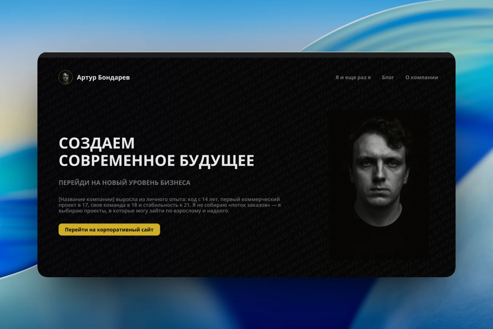
The home page is built on contrast: a dark background, a large black-and-white portrait on the right and the headline “Creating a modern future” on the left. Below the headline is the founder's short story in numbers: coding since 14, first commercial project at 17, his own team at 18 and stability by 21 — and a stance: not a “stream of orders”, but projects you can commit to for the long haul. The only accent button — “Go to the corporate website” — is highlighted in gold. The word ALFA is faintly repeated in the background, linking the personal site to the company's brand identity.
Navigation is intentionally short: “Me and me again”, “Blog” and “About the company” — the three questions a visitor comes with.
Blog
The article page is designed for long reads: the category and reading time above the headline, a highlighted lead, body text broken into numbered chapters and full-column-width illustrations. The first article is that very story, “From the backwoods to stability by 21”: how the interest in programming grew, where the first projects and team came from, and how processes and a design system came through mistakes. On the right is an “Other news” column with article cards so the reader moves on to the next piece without returning to the feed.
The blog feed is a grid of cards with a cover, category, reading time and headline. Above it are search and filters by year and category, making it easy to navigate as the blog grows. In the mockup, the cards are still filled with placeholders — the structure is designed to be filled with real articles.
Result
We designed a personal website in a dark, restrained style that introduces visitors to the founder through his story and writing, gives him a blog platform with search and filters, and leads interested people to the company's corporate website.