About the project
Aurorium is an anti-detect browser for working with a large number of accounts. Each browser profile gets its own digital fingerprint, proxy and cookies, so to websites it looks like a separate device. Tools like this are used by teams that run dozens or hundreds of working accounts, for example in traffic arbitrage. We designed the app's interface: profile creation, the profile list, the user account and payments.
The challenge
An anti-detect browser is a technically complex product. A single profile has dozens of parameters: operating system, graphics card, screen resolution, time zone, language, WebRTC, Canvas, WebGL and much more. A newcomer gets lost in these settings, while an experienced user needs to create profiles quickly and by the dozen. We had to build an interface that works for both: a simple "default" path and full access to the details for those who need it.
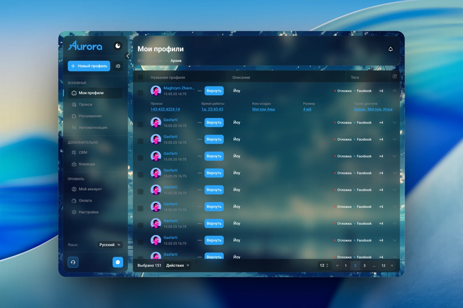
The second challenge was visual. Most products in this niche look like utility panels. We wanted Aurorium to be pleasant to work in all day long, so we built the interface on semi-transparent panels over an atmospheric night background, with a single blue accent color for actions.
Creating a profile
The profile creation screen is split in two. On the left are the main settings, grouped by meaning: name, group and tags; browser engine; operating system — Windows, Mac or Linux; proxy — no proxy, new, from a list or provided by the service itself. The start page, cookies and description are collapsed, and all fine-tuning is tucked into a separate "Advanced" block. Every parameter has a tooltip.
On the right is a summary of the resulting fingerprint: CPU, memory, graphics card, resolution, MAC address, time zone, language, geolocation, fonts and the status of protection mechanisms. It can be assembled from a template or generated with a single button. The user always sees what device the profile will look like to a website before clicking "Create profile".
Working with profiles
When there are hundreds of profiles, what matters most is finding the right one quickly and working with several at once. The profile list is built as a table with name, description and colored tags. A row expands to show details: proxy, running time, who created the profile, its size and which team members have access to it. At the bottom are a counter of selected profiles and a bulk actions menu, and the archive lets you bring back deleted profiles with a "Restore" button.
Account and pricing
The "My account" section gathers the user's details, the balance with a top-up button, password change and two-factor authentication. Below are the current subscription with limits on profiles and team members and a log of recent logins with IP addresses. For a product that other people's working accounts pass through, login history is not a formality but a way to spot unauthorized access quickly.
The payment screen shows four plans in cards where the same features sit on the same rows, so plans are easy to compare. The higher tiers add teamwork, CRM, API and automation. The billing period is switched at the top, the discount for a longer term is visible right away, and for non-standard needs there is a separate "Contact us" block at the bottom.
The result
We designed an interface in which complex technical setup is broken down into clear steps: you can create a profile in a minute with default settings and, when needed, check every fingerprint parameter. The side menu brings together profiles, proxies, extensions, automation, CRM and the team, all in one visual language.