About the project
CardsOnline is a service that helps citizens of Russia and other countries get a VISA or Mastercard debit card from a foreign bank. Clients don't have to fly to another country themselves and figure out local banks' requirements: the service selects the country, arranges the card end to end and hands it over at an office in Moscow or sends it by delivery. We designed the cardsonline.ru website.
The challenge
Getting a foreign card through an intermediary is a service people approach with caution: it involves money, personal data and banks in another country. So the website had to do more than describe the service — it had to address the main concerns before a person even starts reading the details: how official it is, whether it's safe, when to pay and how long to wait. At the same time, the core idea — “a card that's simple to use” — had to come across from the first screen.
The first screen
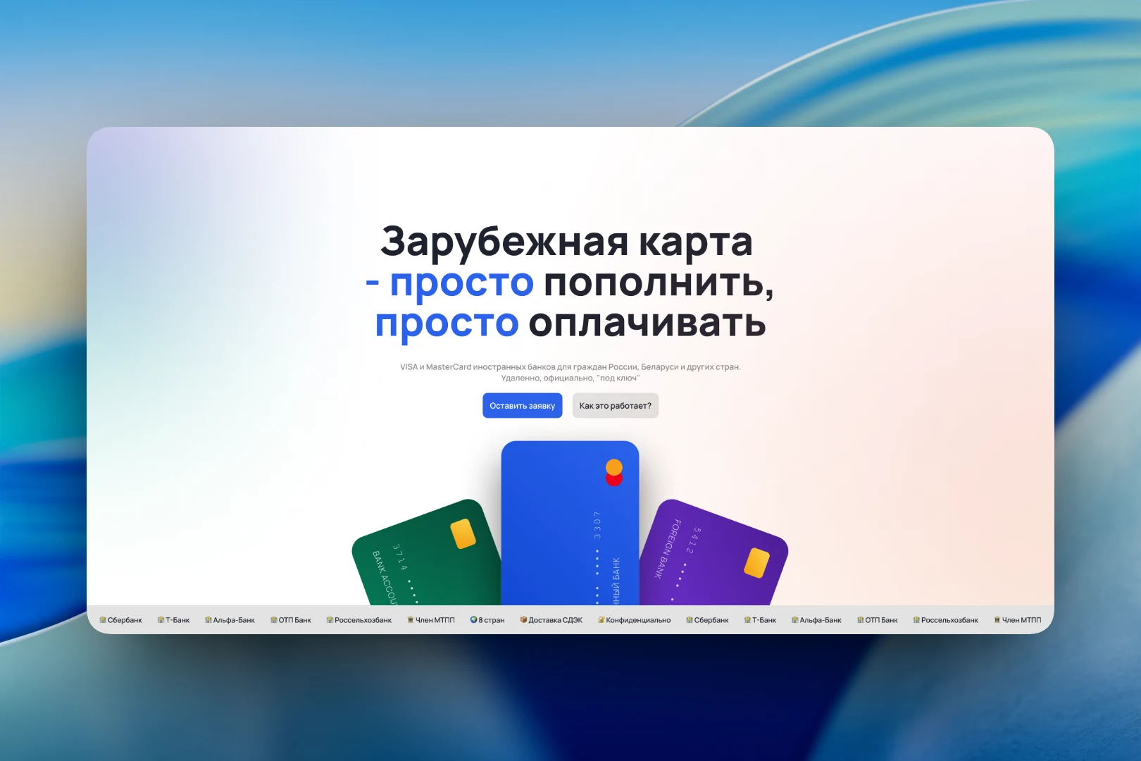
We built the headline “A foreign card — simple to top up, simple to pay with” around the repetition of the word “simple”, highlighted in blue: in a topic that seems complicated, the main promise is simplicity. Below it are two buttons for different visitors: “Submit a request” for those who have already decided, and “How does it work?” for those who are still figuring it out. At the bottom of the screen is a fan of three bank cards in different colors, set against a bright grainy gradient that makes the site stand out among strict banking pages.
Along the bottom edge of the first screen runs a ticker with trust signals: bank names, membership in the Moscow Chamber of Commerce and Industry, CDEK delivery, confidentiality. It works as a short summary of the whole site and is visible immediately, without scrolling.
“Why us?”
The “Everything you need — in one place” block addresses the client's doubts one by one. We assembled it from cards of different sizes to highlight what matters most. The large dark cards cover the official status (partnerships with banks and membership in the Chamber of Commerce) and the choice of four countries: Kazakhstan, Uzbekistan, Armenia and Kyrgyzstan, with flags and the VISA, Mastercard and UnionPay payment systems.
Between them are short light cards with specific facts: full confidentiality and an NDA on request, a 0/100 payment scheme with payment upon receipt of the card and a “No risk” label, up to 14 days from request to card, an office in Moscow with directions from the Garden Ring, Paveletsky railway station and the metro, and delivery to other countries via EMS or DHL. Each card has its own icon so the block is easy to skim.
The result
We designed a website that sells not a card but confidence in the deal: the first screen explains the essence of the service in a single phrase, and the “Why us?” block answers questions about legitimacy, security, payment, timing and delivery before the client even asks them. Two entry points — a request and an explanation of “how it works” — let the site guide both those who have already decided and those who are just looking around.