About the project
Chatty Dating is a mobile dating app that combines matchmaking with a social network: users have a post feed, stories, followers and chats. We worked on the design of the app’s interface.
The challenge
Classic dating apps boil down to swiping and messaging. Here the goal was to build a product that gives people something to do beyond matching: browse other people’s photos and videos, post their own and chat. At the same time, the main scenario — meeting someone — had to stay front and center, and the interface had to remain light and recognizable.
Matchmaking
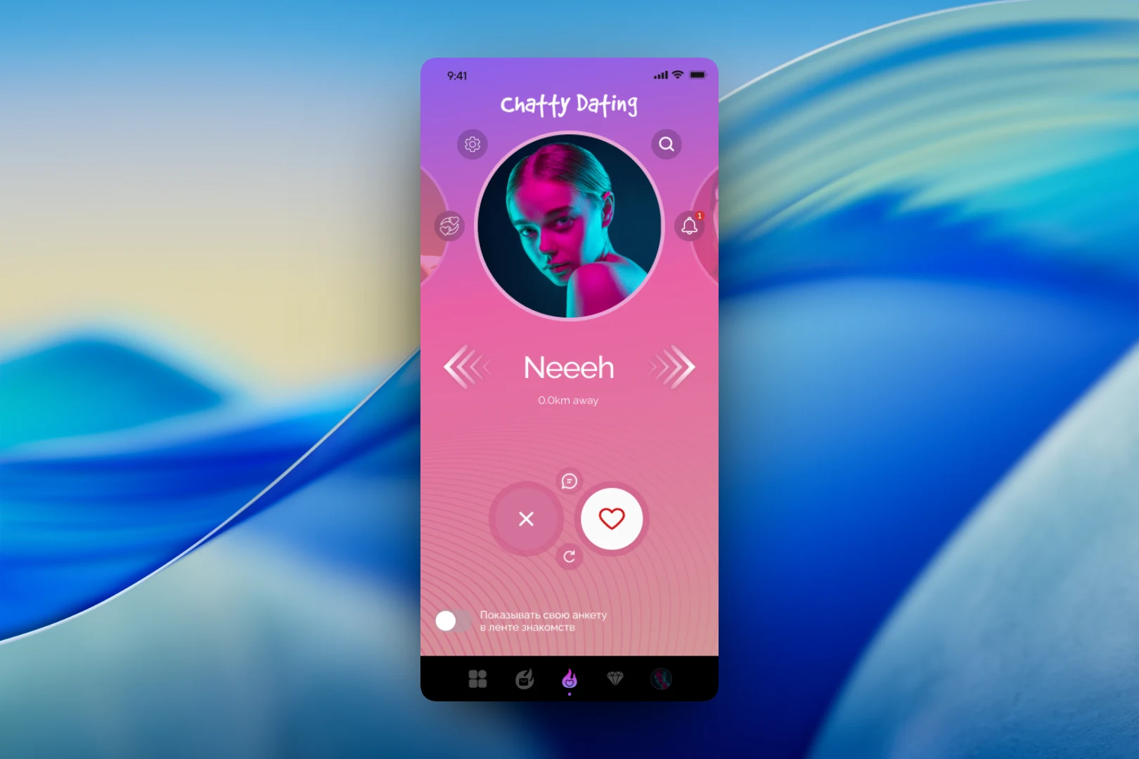
The central tab of the bottom menu opens the dating screen. In the middle there is a large round photo with the person’s name and distance, neighboring profiles peek out at the sides, and arrows hint that you can swipe through them. Below the photo are two main buttons — pass and like — with smaller actions next to them: message right away and bring back the previous profile. At the bottom there is a toggle, “Show my profile in the dating feed”, so users decide for themselves whether others can see them.
Feed and stories
The first tab is a feed with search, a filter and the “All”, “News”, “Photos” and “Videos” sections. Posts are laid out in a two-column grid of varying heights, and under each one you see the author’s name and age, a like counter and a “share” button. This way, getting to know someone can start not with a profile but with a photo you liked.
Stories open full screen: at the top there is a progress indicator, the author’s avatar and the time of posting; at the bottom, a “Message” field, a like and a send button. Replying to a story instantly turns into the start of a conversation.
Messaging and profile
In the chat, a horizontal strip of conversation partners’ avatars runs above the messages, letting you switch between them quickly. The conversation itself works the familiar way: messages with timestamps and read receipts, an input field, a send button and a button for attachments.
The profile follows social network logic: a large photo, a row of extra shots with an add button, name and age, follower and following counts, a short bio and a gallery of posts with an “Add” tile. Empty photo slots are shown as silhouettes with a question mark, making it clear that the profile can be filled out further.
Result
We designed an app where dating, content and messaging are connected: from the feed you can go to a person’s profile, from stories into a conversation, and your own profile works both as a dating card and as a social media page. A vivid purple-and-pink gradient and a handwritten logo make the product recognizable across every screen.