About the project
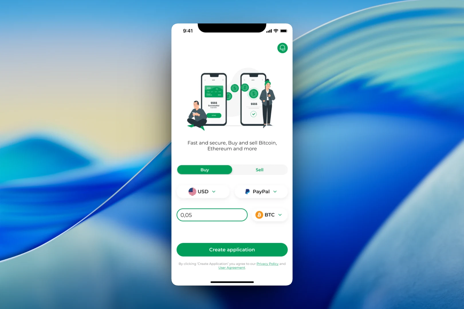
Crypto app is a mobile exchange for buying and selling cryptocurrency. The user picks the deal direction, the currency and the payment method, enters an amount and submits a request, and from there the app guides them step by step all the way to the transfer.
The challenge
For an inexperienced person, exchanging crypto looks intimidating: networks, wallet addresses, bank details, settlement times. A mistake in any field can cost money. We had to design an interface where a deal is assembled from a few clear choices, and all the technical details appear exactly when they are needed.
A deal on one screen
The start screen is both the home page and the request form. At the top is a Buy / Sell switch, below it the fiat currency (USD) and the payment method (PayPal), then the amount field and the cryptocurrency picker. At the bottom there is a single button — “Create application” — plus links to the privacy policy and the terms of use. A support button is always available in the top right corner.
The cryptocurrency picker opens over the form as a compact list: BTC, ETH, BNB, plus USDT on two networks — TRC20 and ERC20. The network is labeled right next to the ticker so the user doesn't mix up variants of the same token — for an exchange, this is one of the most frequent and most expensive mistakes.
Payout details
When the money needs to go to a bank account, the app asks for SEPA transfer details: recipient name, IBAN, country and BIC. A contact email is an optional field. Below the form, the payment processing time is stated honestly — from 1 to 48 hours, business days only — and there is a support contact underneath so questions can be asked without leaving the flow.
Payment and request status
Once the request is created, the user sees everything needed for the transfer: a QR code with the selected coin's icon, the BTC address and the total amount. Both values can be copied with a single tap, and a 60:00 timer in the corner shows how long the request remains valid. At the bottom there are two buttons: “Check” to verify the incoming payment, and “Continue” to move on.
The final step is a modal explaining what happens next: the request is processed automatically, the timing depends on network load, and status updates will arrive by email. The contact address is repeated right there. The mockup also shows a Russian-language version of the request screen — the interface was designed with localization in mind.
Result
The outcome is a short and predictable exchange flow: the deal is configured on one screen, token networks are labeled explicitly, bank details are requested only when needed, and after paying, the user knows how long to wait and where to check the status. An interface like this removes most support questions before they even come up.