About the project
Doctor App is a patient mobile app that brings together personal details, a medical record and doctor appointments. We designed the interface so that both a young user and a parent managing several profiles at once — their own and their children's — could find their way around it with equal ease.
Challenge
Medical information is usually scattered: test results are in one place, insurance numbers in another, children's details in a third. We needed to bring all of this together in a single app without overloading it. The core principle: each screen shows only a few large, clear sections, while the details open one level down.
Home screen
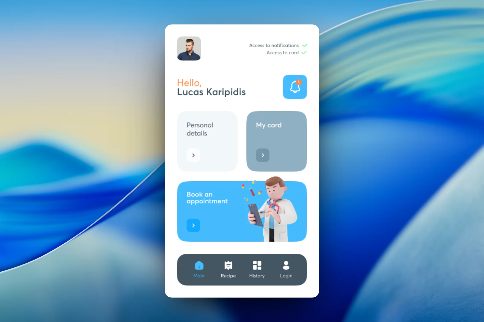
The app greets the user by name and immediately shows the access status: whether notifications are enabled and whether access to the medical record is granted. Below are three large cards: "Personal details", "My card" and "Book an appointment". Booking a doctor gets the biggest card and a 3D illustration of a doctor — it is the main action people open the app for most often. In the top right corner there is a notification bell with a counter.
A bottom navigation bar with four sections is always available: Main, Recipe, History and Login. This keeps prescriptions and visit history just one tap away, wherever the user is in the app.
Medical record
The "My Card" section follows the same logic as the home screen: large cards instead of long lists. It contains three areas — "Tests" with examination results, "Visits" with appointment history and "Curves" for charts of health indicators.
In the list of examinations, each entry is a separate card with the name, document type and date, for example "Echo of hips" or "Jaundice test". The screen header shows an avatar with initials so it is clear whose record the user is viewing — which matters when there are several family members in one account.
Personal details and family
The "Personal details" screen gathers in one place everything usually requested at the front desk: gender, date of birth and age, user number, social security number, tax number and address. The data is split into short labeled fields so that the right value can be found at a glance rather than by reading.
Below is the "Children" block. Each child is a colored expandable card: collapsed, it shows only the name; expanded, it shows gender, date of birth, age and insurance number. Color helps tell profiles apart quickly.
A new family member is added through a separate "Add family member" form: gender is selected from a list, first and last name are entered in large fields, and the date of birth is picked in a built-in calendar with no manual typing. The form uses the same pink color as the child's card, so the user sees the connection between the action and its result.
Result
We designed an app in which patients keep their documents, examination results and children's details close at hand and can book a doctor right from the home screen. Large cards, a soft palette and color-coded profiles make the interface clear without instructions and convenient for a family where one adult handles the medical matters of several people.