About the project
This is the interface of a car game in which the player has their own garage: they collect cars, store parts in a warehouse, buy paints and license plates, and expand their space. We designed the game menu — the main sections through which the player manages their fleet.
The challenge
A game interface should complement the visuals rather than get in their way. At the same time, there are many sections — garage, workshop, warehouse, shop, settings — and the player needs to switch between them quickly. We had to build navigation that works the same way on every screen, and a visual style that blends with the 3D scene.
Garage
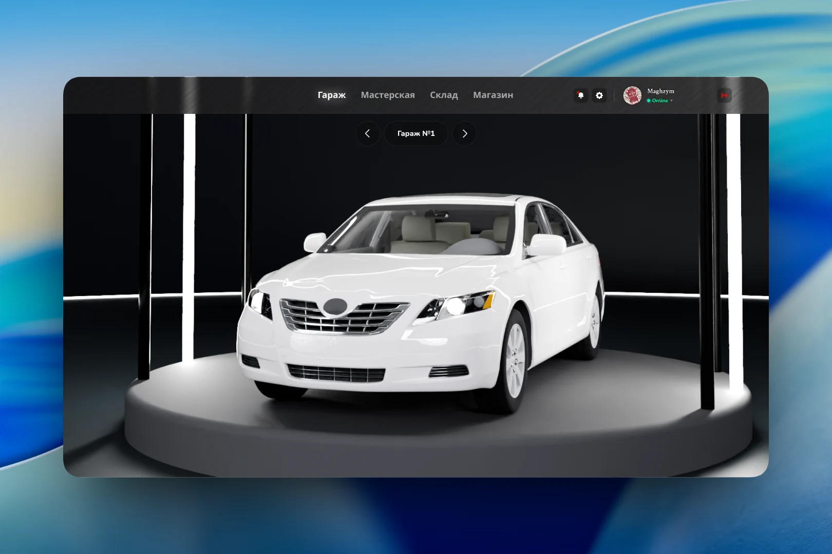
The main screen is the car itself. It stands on a round platform in a dark bay with vertical light strips, with minimal interface around it. Above the car is a “Garage #1” switcher with arrows: a player can own several garages, and flipping through them is as easy as browsing photos in a gallery.
The top bar is shared across all screens: four sections — “Garage”, “Workshop”, “Warehouse”, “Shop” — plus notifications, settings, the player's avatar with an Online status and a logout button.
Warehouse and shop
The warehouse stores parts. The screen is built as a dense grid of cards: a part image, its name and class, and a colored strip under the picture indicating rarity or category. At the top are search, a filter by part type (for example, “Engine”), sorting and two gift icons for bonus items. The background behind the grid is blurred so the cards read clearly.
The shop is split into themed rows: “Paints” — six colors with a color tag on each card, “Plates” and the “Expander”, which adds another garage. Each item has a price and a cart button. Large headings and short captions (“Buy paint for your car”) make the catalog clear at a glance.
Settings
Settings open over the blurred garage scene and are split into groups: graphics (screen resolution, display mode), interface (language) and sound — master volume, interface sounds, music and game sounds, each with its own slider and percentage. On the right is a panel with a hint for the selected item, so the player doesn't have to guess what a given setting does.
Result
We designed a unified system of game screens: a shared top navigation, a dark palette with a single green accent for prices and purchases, and a blurred scene in the background. The player switches between the garage, warehouse, shop and settings without losing the feeling of being inside the game.