About the project
Human Code is a mobile app for self-discovery and working on relationships. The user goes through a program of 22 themed modules — in the app they are called “takes”: they watch videos, answer questions about themselves and gradually unlock the next topics. We designed the app's interface.
Challenge
The topics the app deals with are personal and difficult: for example, gaslighting, devaluation and manipulation in a couple. The interface shouldn't look like a textbook or a test — it needs a calm, tactile environment where people want to stay. At the same time, the program is long, so the user should always see where they are and how much is left. We also had to build the monetization model into the interface: one module is free, the rest are in the Pro plan.
Visual language
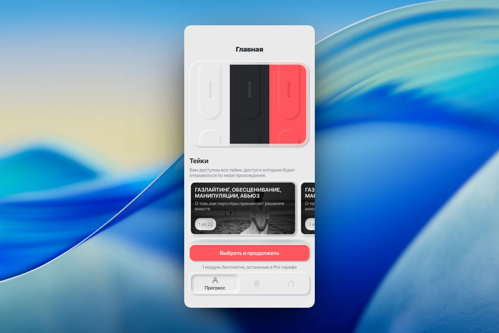
We chose neumorphism: soft, raised buttons and cards that look as if they were pressed out of a light gray surface. The palette is limited to three colors — light gray, graphite and a red-coral accent; on the home screen they are shown directly as a palette. Photos in the cards are black and white, so the accent color is reserved for actions and progress.
The home screen has a horizontal feed of takes with the counter “1 of 22” and a note that modules unlock as you progress. At the bottom are the “Choose and continue” button with a caption about the free module and the bottom navigation bar.
Room of Life
Each take opens with the “Room of Life” screen: a cover image, the topic title and three expandable blocks — “Description”, “Frustration” and “Psychomechanics”. The user decides how deep to dive into the theory before moving on. The main button leads to the next stage — the “Room of Sleep”.
Questions
The questionnaire is the core mechanic of the app. At the top is a circular indicator of overall progress with a human figure and a percentage, with the counter “3 of 111” above it. Below are the question category (“Personal”) and the progress within it. The questions are phrased in the first person and offer answer options, while the “Back” and “Next” buttons let the user return to a previous answer. The “Saved offline” caption reassures users that their answers won't be lost without internet access.
Memory Altar
The “Memory Altar” brings everything completed together in one place. At the top is the “Accepted symbols” scale with a percentage, and below it a row of numbers for all 22 takes, with completed ones highlighted in color. For the selected take, there are videos with a player, an expandable block with an explanation and the “Take symbol” — an image that reinforces the topic.
Result
We designed an app in which a long psychological program is broken down into clear steps, and progress is visible on every screen — in the feed of takes, in the questionnaire and in the “Memory Altar”. The soft neumorphic interface and restrained palette create a calm atmosphere for working through personal topics, while the free-access limit is built into the screens unobtrusively — as a caption under the main button.