About the project
Qleaner is a mobile app for a subscription-based trash pickup service. A resident of an apartment building chooses a plan and a time slot, and the service collects their trash on a regular basis. We designed the app's core screens: building selection, the home screen with plans, and subscription checkout.
The challenge
Taking out the trash is a minor household chore — nobody is going to spend long figuring out an app for it. The whole journey from installation to payment had to take about a minute: specify the building, choose how often the trash is picked up, set a time and pay. On top of that, the service operates in specific residential complexes, so the first step had to determine whether it is available to the user at all.
Choosing a building
The app starts with the “Find your building” screen. Users type a street into the search bar or pick their residential complex from a list of cards, each showing the complex name and address. The selected card fills with the brand lilac color and gets a checkmark, while the “Select” button stays pinned to the bottom of the screen.
Home screen and plans
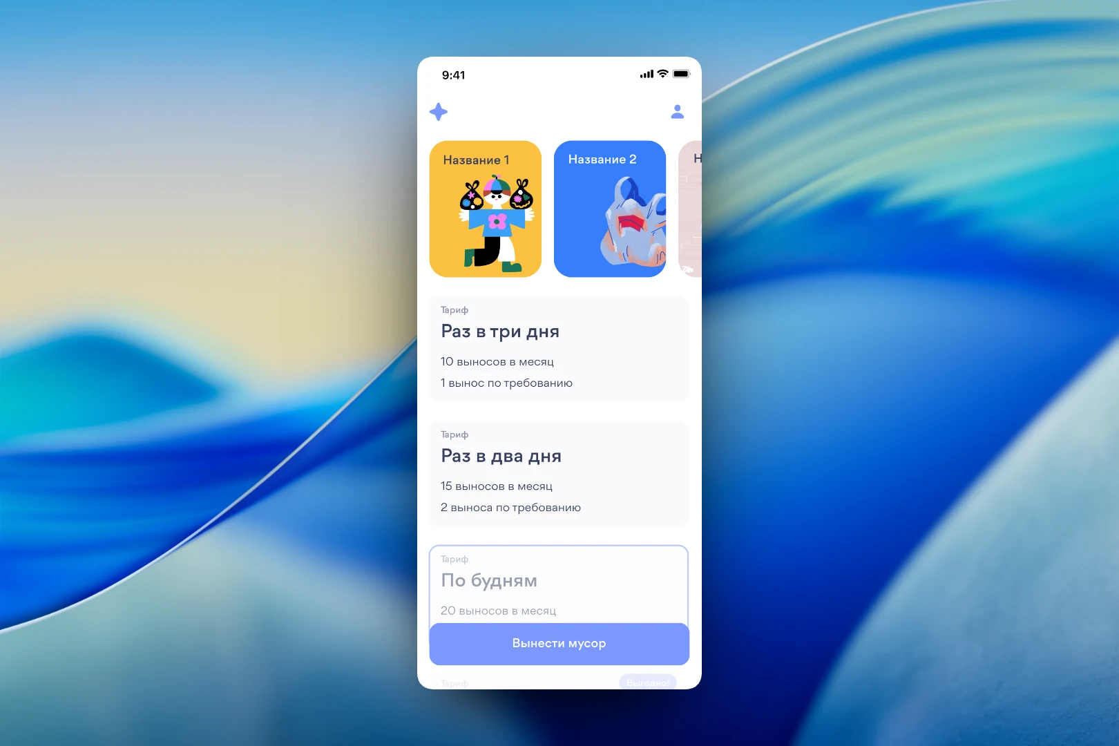
At the top of the home screen is a horizontal carousel of bright illustrated cards: in the mockup they carry placeholder captions and are intended for the service's promotions and news. Below are the plans, which differ in frequency: “Every three days”, “Every two days” and “On weekdays”. Each card shows how many pickups are included per month and how many extra on-demand pickups can be ordered. The best-value plan is marked with a separate badge. The main “Take out the trash” button is pinned above the list.
The card illustrations are done in a playful flat style to take the household dullness out of the topic and make the app friendlier.
Subscription checkout
On the plan screen, users choose a pickup mode — “On demand” or “Scheduled” — and, for a schedule, select a half-hour slot from a horizontal strip. Below is an “Auto-renewal” toggle with a note on which day of the month the payment is charged, so the subscription terms are visible before paying. A “Total” panel slides up from the bottom with the final amount, the plan name, the selected mode and time, plus a “Pay” button.
Results
We designed an app where a trash pickup subscription takes just a few taps: choose the building, plan and a convenient time, review the summary and pay. Plans are compared by a single clear metric — the number of pickups per month — and the auto-renewal terms are shown upfront. A light interface with lilac accents and hand-drawn illustrations makes the service simple and friendly.