About the project
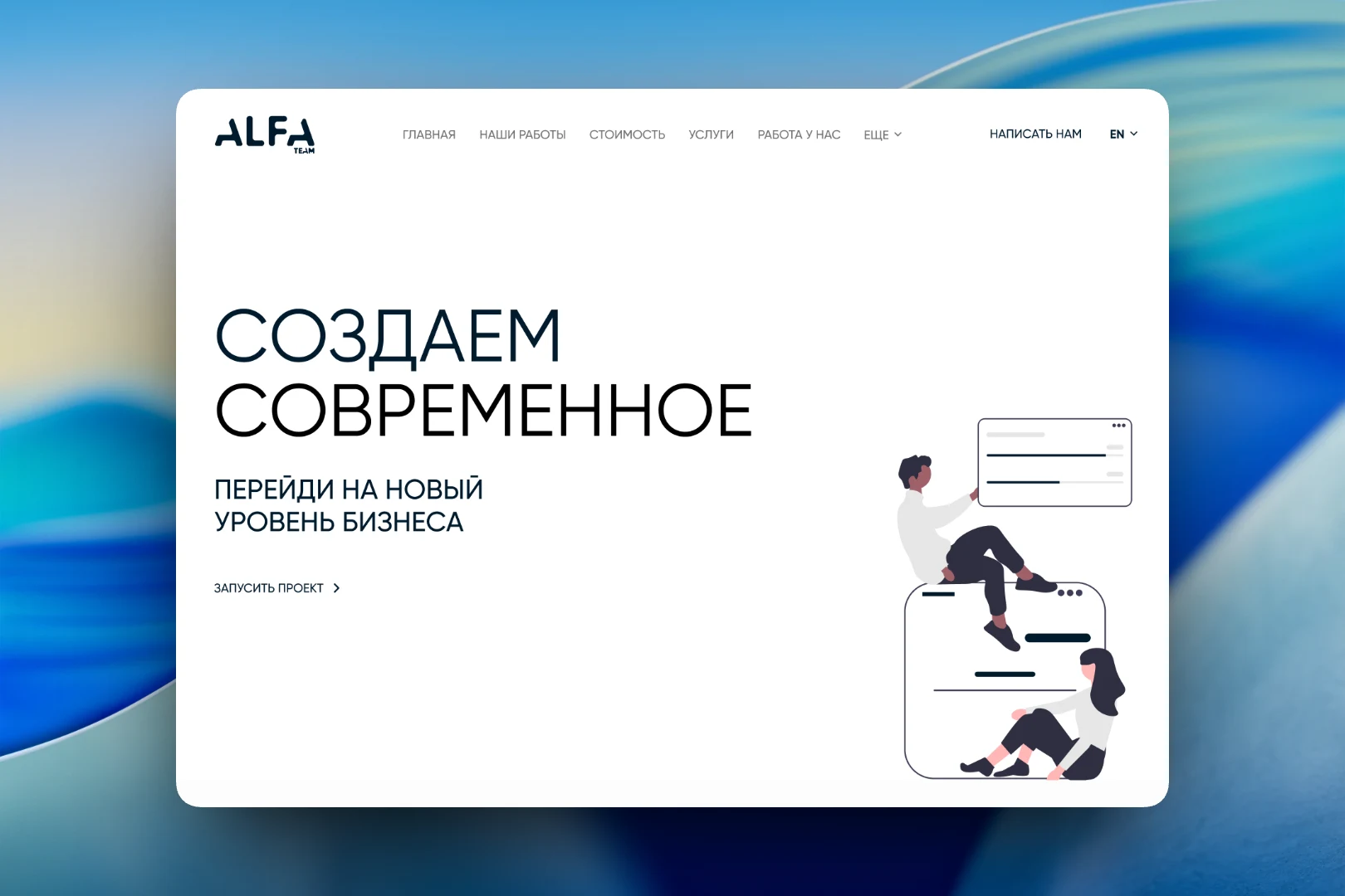
This is one of the early versions of Alfateam's own website — a light, almost monochrome concept. Our studio website has always been a testing ground for us: we try out approaches to structure, navigation and content presentation on it before offering them to clients.
The challenge
In this version we wanted to move away from a cluttered presentation and build a site where typography and white space take the lead. At the same time, the site had to accommodate many different sections — portfolio, services, outstaffing, careers, events, merch and corporate documents — and still be easy to navigate.
First screen
The home page is built around a large headline, “We create modern”, and the subheading “Take your business to a new level”. Below them is a single action: “Launch a project”. On the right is a calm line illustration in the same graphite palette. The header holds the main sections, a “More” item for secondary pages, a “Contact us” button and a language switcher.
Portfolio and events
All inner pages follow one template: breadcrumbs, a section title, a filter bar with a “Search” button and a grid of cards. In the portfolio, projects can be filtered by service and industry, and there is a search by name. The cards are large, with a project preview and a short description over the image.
The events section uses the same logic but different filters — format and topic. An event card shows a format label (“Online”), the participation fee, the date and the venue. The screenshots show test content we used to check the grid and title lengths.
Merch and compliance
We also designed a separate storefront for the studio's merch: a category filter, sorting by price and product cards with a “Many colors” label, the name and the price. It's a small catalog, but it follows the same rules as the rest of the site, so it doesn't look out of place.
The “Compliance” page is an example of a section usually hidden in the footer. Here we gave it a full-fledged look: an introductory text about the company's principles and a grid of documents with a preview, title and file size — orders, policies, management statements, including some in English.
Result
This version of the site laid down a structure we returned to more than once: a single template for inner pages with filters, a card grid for any type of content and careful work with typography. It is where we tested how to fit very different sections onto one site without compromising navigation.